Love
(Click to Enlarge) The above image is a fantastic piece of Graphic Design. The use of colour, limiting it to blues and greys for a simplistic design, a well thought out selection of fonts. I also think the vector banners add a nice quality to the image.
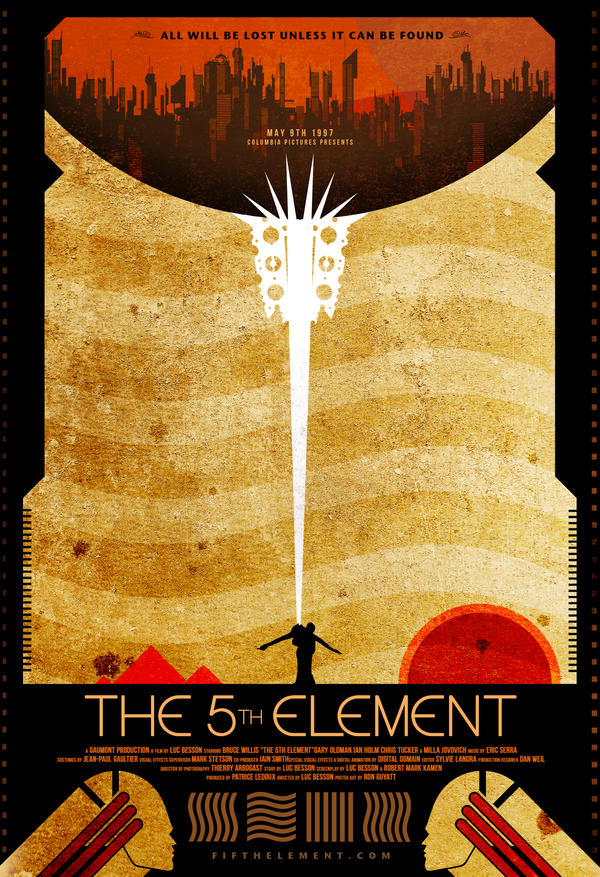
This is an alternative post to the 5th element. The use of warm colours, with the contrasting black and the striking white works extremely well in this image, the warm colours blending together with the harsh white being very in your face.
Hate
The above image is from "crap is good", which is a new style, which as you can see if pretty crap, the simple font, centre aligned looks okay, however the random architecture-style images thrown around the pages makes the entire book cover look poor. Crap is good? Crap is crap.


Leave your comment