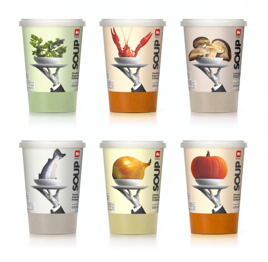
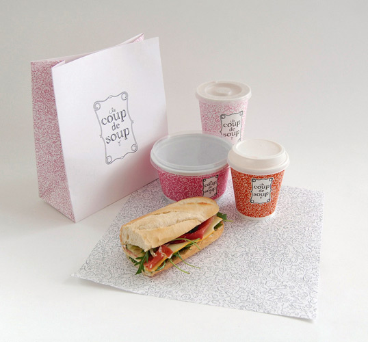
Soup/Coffee Take Aways Cups
Designed by Lavernia & Cienfuegos | Country: Spain “The brief was to bring to life the principle ingredient, preferably through the use photo-realistic images, with something that adds a touch of good humor before serving.
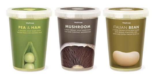
Designed by Pearlfisher | Country: United Kingdom. If only all supermarket own-brands had packaging that looked this good…
Designed by Peter Urban | Country: Denmark. Nice concept work by 21 year old Peter Urban from Copenhagen. Showing a large range of consistent branding.
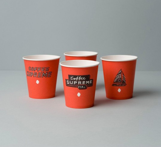
Designed by Hardhat Design | Country: United Kingdom. Coffee Supreme’s take-out cups were already known in NZ and Australia for being unusual, distinctive and quirky, so while we knew from our re-brand brief that they wanted the brand to ‘grow up’, we felt it was important they didn’t lose their individuality.
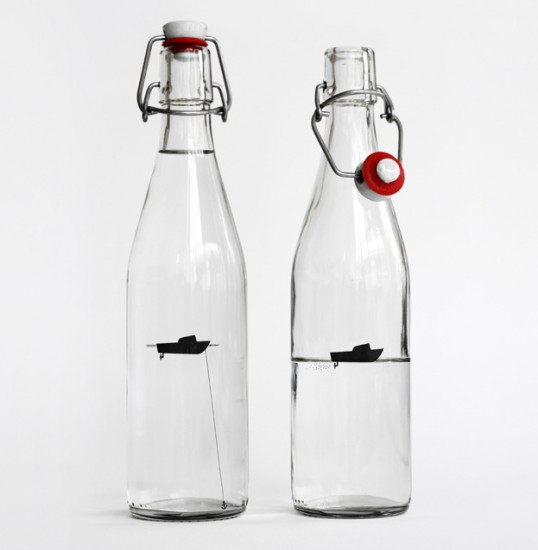
Table Water & In-house Beverages
Designed by Designers Anonymous | Country: United Kingdom “We designed refillable water bottles for use during meetings held in our studio. Our bottles feature a simple silhouette of a boat (in-keeping with our brand styling) the boat was a natural fit for a water bottle. On the still water bottle It’s anchored and stationary; for sparkling water, the propeller creates bubbles.”
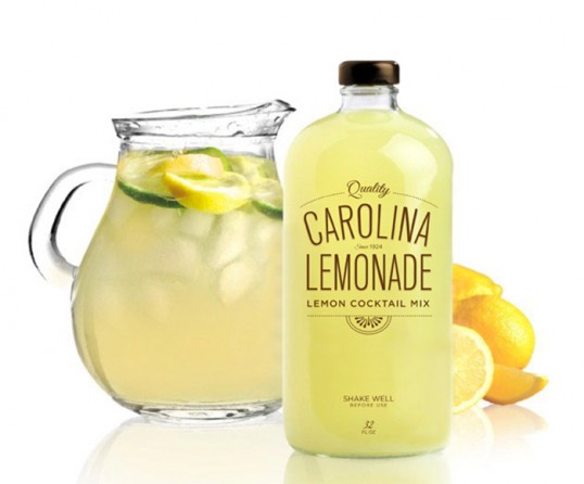
Designed by Jessica Haas | Country: United States “This was a school assignment in Packaging 101. The project was to design a beverage of your choice and the challenge was hat you’re limited to only one color. We the lack of 4 color imagery I was forced to utilize the color of the beverage itself. A few people in my class were doing juice so I moved to a more fun option, a cocktail mix which allowed me to experiment with different bottle shapes. The Boston round had a great feel to it and was calling out for typography. I decided to keep it simple and just use type but my professor felt it needed some sort of appetite appeal. I finished the assignment off with a small illustration of a lemon slice which I think really makes the piece eye catching.”
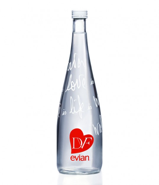
Designed by Diane Von Furstenberg | Country: United States “Diane Von Furstenberg & Evian® have partnered to design the latest limited edition bottle, which reflects a playful celebration of life. For the collaboration, DVF drew inspiration from her personal relationship with evian water and her own love of life: ”
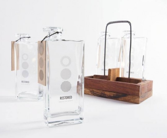
Designed by Morgan Sterns | Country: United States “The Restored water identity and packaging concept was strongly influenced by the process of taking highly treated wastewater that would have previously been discharged into the Pacific Ocean and purifying it using a three-step advanced treatment process. My main objective was to create a brand that would be a blueprint for water agencies throughout the world in order to help solve local water supply issues.
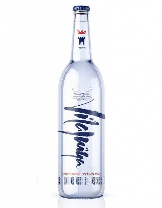
Designed by Studio h | Country: United Kingdom “Studio h has created award-winning brand and packaging design for Aigua de Vilajuïga, naturally sparkling mineral water from the heart of Catalonia’s de Creus Natural Park since 1904, and famed for being Salvador Dali’s favourite water. Tasked with reviving this historic Catalan water brand by re-positioning it as a limited edition water for the global market, the Dali connection was taken as the inspiration for the unique brand personality.”
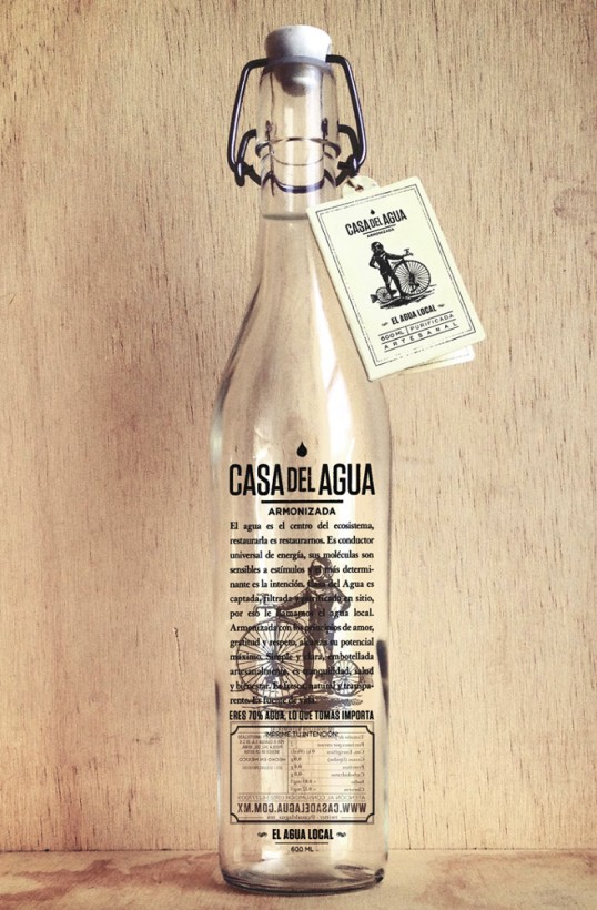
Designed by Cadena + Asociados Branding | Country: Mexico “Casa del Agua is an artesian bottled water boutique based in Mexico City. Water is the center piece of any ecosystem, making better water is making a better us. Water is the main conductor of energy, its molecules are sensitive to human intention. Our water is collected, filtered and purified on site, that´s why we called it local water. We stimulate water with our basic values: love, gratitude, and respect, therefore it reaches its highest potential. Simple and clear. Our water is craft bottled in a calm environment.”
This project defines various aspects that concern those elements of communication, through its naming, voice and visual communication throughout. Within this are the brand’s signature (symbols, logo, typography), institutional colors, palettes and patterns, labels, and packaging among others.
Take Away Wrapping
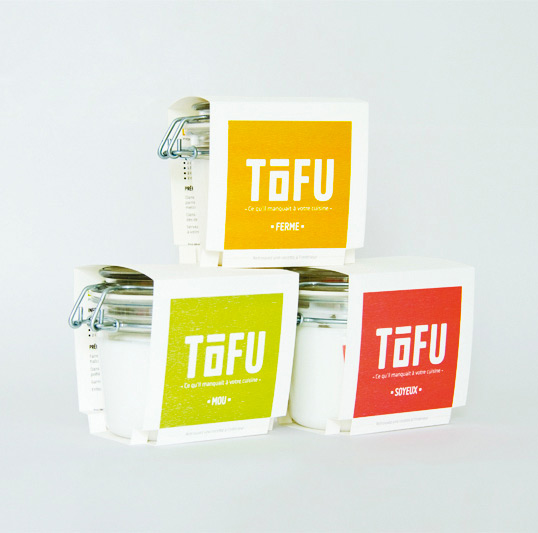
Designed by Cécile Dumetier | Country: France. “Branding and packaging for a brand of Tofu. The objective is to westernize this product and to encourage people to include it in their daily meals. To do so, a few recipes are included on the packaging.”
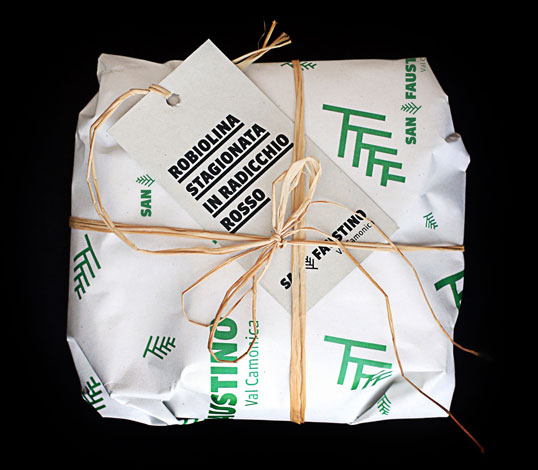
Designed by Gianluca Camillini | Country: Italy. “The logo that I’ve designed is from a primitive sign found in a paleolitic cavern in Val Camonica (Italy). I’ve created a texture with my logo to cover all of SAN FAUSTINO’s products.”
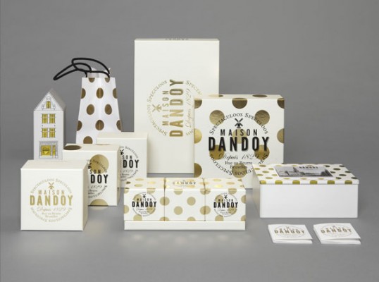
Designed by Base Design | Country: Belgium. “With values rooted in the past but a business plan oriented toward the future, Dandoy asked Base Design in 2011 to modernize and rethink its visual identity, packaging range and website. The main questions to solve were “How do you transform a small-scale, local family business into a global family brand, without losing the image of local craftsmanship and true tradition?” and “How to reach a broader audience?”.

Leave your comment