Archives

OUGD501: STUDIO BRIEF 2 - Theory Into Practice // Packaging Research


https://www.behance.net/gallery/13987513/Nada


https://www.behance.net/gallery/14665741/From-Rgua-With-Love


https://www.behance.net/gallery/15566041/Koronaki-()-Virgin-Olive-oil


https://www.behance.net/gallery/7173405/CHV-Concept-box-design

OUGD501: STUDIO BRIEF 2 - Theory Into Practice // Mock Ups

I've begun to flesh out a new concept, following a small critique I took part in with a few members of the group - which I'll explain here. I presented the ideas displayed in previous posts, also mentioning I had context but no content to the idea. Which didn't make it very feasible.


Instead taking a product and re-marketing it based on the themes and ideas of consumerism. For example, re-packaging a fragrance. The fragrance is something which receives heavy treatment from consumeristic tendencies, the majority of ads for fragrances offer celebrity endorsements and other means of manipulation through association. The fragrance is marketed to be the tool which transforms the consumer into the celebrity endorsing the product.


I mapped out ways which I could rebrand a product to follow the consumeristic tendencies, I also discussed the types of products which I could re-market. So I have an idea of what I'll want to create.


I felt like repackaging a fragrance would be the way to go with this project, as fragrances are all but scents, nothing major. The fragrance I would package would just be water in a glass (or plastic) spray bottle. The packaging and promotion would be where I implement the themes of consumerism.


The plan is to create packaging which has been designed to make itself look larger than it actually is. Almost like a penis extension, against the other products. Like size matters.


The sketch above shows how the packaging would work, leaving space about the product, which isn't needed, only to make the product appear larger than it actually his, in hope that this would translate to the consumer's mind that the product would have similar effects to their 'manhood'. Amongst the other products. Size matters.


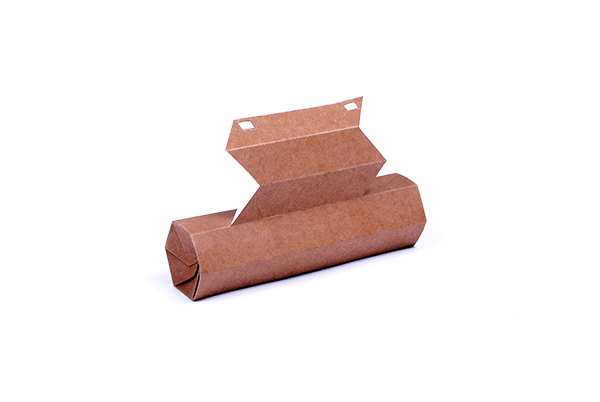
I then mocked up how I might like the packaging to look, so I know if it would be feasible to create when printing.


I sketched out a net, based on some initial research I had previous undertaken, I would say this is the most basic of nets.


I adapted the top half so it was 2mm wider, in every direction, that the lower half, so the two sides slide seamlessly together, without issue. The flimsy material which I mocked it up from compromised the design and manufacture of the packaging, but the real version will be printed on thicker stock, and perhaps even reinforced with mount board, or similar.


The twos sides, which have been separated, they are of equal length, but the stopper in the top half prevents them from closing fully.


OUGD505: STUDIO BRIEF 2 - An Exhibition of Aston Martin // Target Audience Research

To research my what my target audience should be, and how I can better define them, I've started to research into elephants and sticks. Some articles about various owners of Aston Martins, to learn about their lifestyle and what they're like.


The first article I've found comes from the guardian, it's a description of David Richards an Aston Martin owner. I'm use this as a template for the typical Aston Martin owner. 


http://www.theguardian.com/business/2007/mar/23/motoring.lifeandhealth

The article above talks about the typical life style and traits of an Aston Martin owner,


OUGD505: STUDIO BRIEF 2 - An Exhibition of Aston Martin // Cart Fest North, Primary Research

As part of my research for studio brief 2, I'm looking in to similar events, to see what's already been done, if it's good, if it's bad, what works, and what doesn't. So I'll know what I should apply to my own branding and identity within this project, if appropriate and relevant to my audience. 

I'm looking at Car Fest, hosted my BBC Radio 2 DJ, Chris Evans. I was able to attend the 2013 North Festival, which was held at Oulton Park circuit in Cheshire. 


The carfest logo, it's the same every year, although the date usually changes on it. The style of illustration used really reflects what the business is about, as it is for Children in Need, so the illustrative style works for the cause, as well as the target audience for the attendance, which is families. 


As part of Car Fest's branding and collateral, they produced wrist bands. The wristband shown is the weekend wristband. It's crafted from a plastic coated gloss newsprint, which is extremely durable. The day wristbands were a different colour, and made from card, rather than plastic coated newsprint, as they didn't need to be as durable. Since the event doesn't really have a set colour scheme, other than vibrant colours, so they're able to use a large range of colours to separate the wrist bands, depending on their meaning. 


The signage around the event also follows this trend, sporting bright colours and a fairly relaxed hand-written style font. The colours used within this are used across the band and within the logo. 


The cars featured at car fest were lined up and displayed, a huge number of car manufacturers brought dozens of cars.

OUGD501: STUDIO BRIEF 2 - Theory into Practice // Box Dissection Primary Research

As part of my primary research for this brief, I was to learn how packaging works, and what nets are appropriate. I decided to dissect a small box, which originally housed a whiskey glass from the Scotch Whiskey Experience, in Edinburgh. 


The net is connected along the long edges of the box, rather than being connected by the base or the lid, like I did in the mock up. The net also demonstrates how the bottom of the box is joined, and how the lid is connected, in a manner which it can be easily opened. 


The full assembled box. It's rather sturdy and well put together. It doesn't feel flimsily or unstable. Obviously due to the stock there is some give in the structure, but that's an issue across the board with packaging design. 


The base of the box shows how the end pieces fold, for the strongest possible base to the net. I really think this is the best net for this project, and the net I will modify for my packaging. 


Copyright 2010. All rights reserved.

RSS Feed. This blog is proudly powered by Blogger and uses Modern Clix, a theme by Rodrigo Galindez. Modern Clix blogger template by Introblogger.